
Distinctive Design
Packaging
On the Shelf & Online
Retail Packaging
Designing product packaging in any retail setting requires several levels of design-thinking, whether online or on-shelf at brick & mortar stores. In a world full of products, impact and authenticity are key for product success. Often, it is a balancing act between impact, brand stewardship, and fitting all the required information without feeling cluttered.
In package design, we think through the entire sale process. Selecting product packaging materials and understanding how design will scale in different settings all inform the integrity of the design. We may also review weight and dimensions of shippable products, or eco-friendly packaging, like compostable bags or recycled boxes.
Product Packaging
Packaging Material Review
Bag, Box & Bottle Design
Stickers, Tape, & Stamps
Tags, Sleeves, & Tissue Paper
Vendor Decisions & Packaging Materials Selection*
Quote Acquisition & Printer or Vendor Communication
Environment
Environment Assessment & Measuring, when applicable
Product Mock Up*
*Product mock ups use photos of the environment (window displays, shelving, end caps, etc.) to show product design in the environment very close to scale.
*Managing Quality, Cost, and Efficiency: Discovering pathways to improve waste efficiency, postage break points, and packaging saves cost for each print run of your product over time. We determine these pathways together based on your specific needs through communication, trusted vendors, and new research. I love consulting with clients to guide projects toward successful outcomes for long-term cost efficiency and high-quality materials with emphasis on sustainable, recycled or compostable packaging.
Work with a consultant to advise you on legal requirements associated with your product. For your reference, I’ve compiled a basic resource list to share with clients.

Packaging Feature
Eli’s Hot Rockin’ Cereal
My friend Eli is amazing. He’s a professional contractor, he patented a beautiful, easy-install flat roof flashing system called CoFlash. And now he has brought his own hot cereal recipe to market which can be purchased at coops and grocery stores throughout the Twin Cities. We designed the packaging to feature his drawing of cereal bowl on a skateboard. Some people think it’s a spoon, and we’re ok with that! It’s cool, it’s fun, and it stands out on a shelf. Portions of the road and bowl are clear to show the cereal inside the bag. This logo design also looks great on the locally-screen printed Hot Rockin’ t-shirts that Eli envisioned in an awesome color palette and array of styles.
Eli has been making this hot cereal recipe for 20 years and now everyone can have it. It’s healthy, made with organic ingredients, it’s anti-glop, and kids love it! It’s in regular rotation for breakfast at my house too.


Packaging Feature
Kopplin’s Coffee
These letterpress bags feel as special as the in-house roasted coffee tastes.
Color was used to indicate bean variety: green for coffee; blue for premium coffee; and brown for espresso. A Select Origin sticker further highlights the specialty coffee.

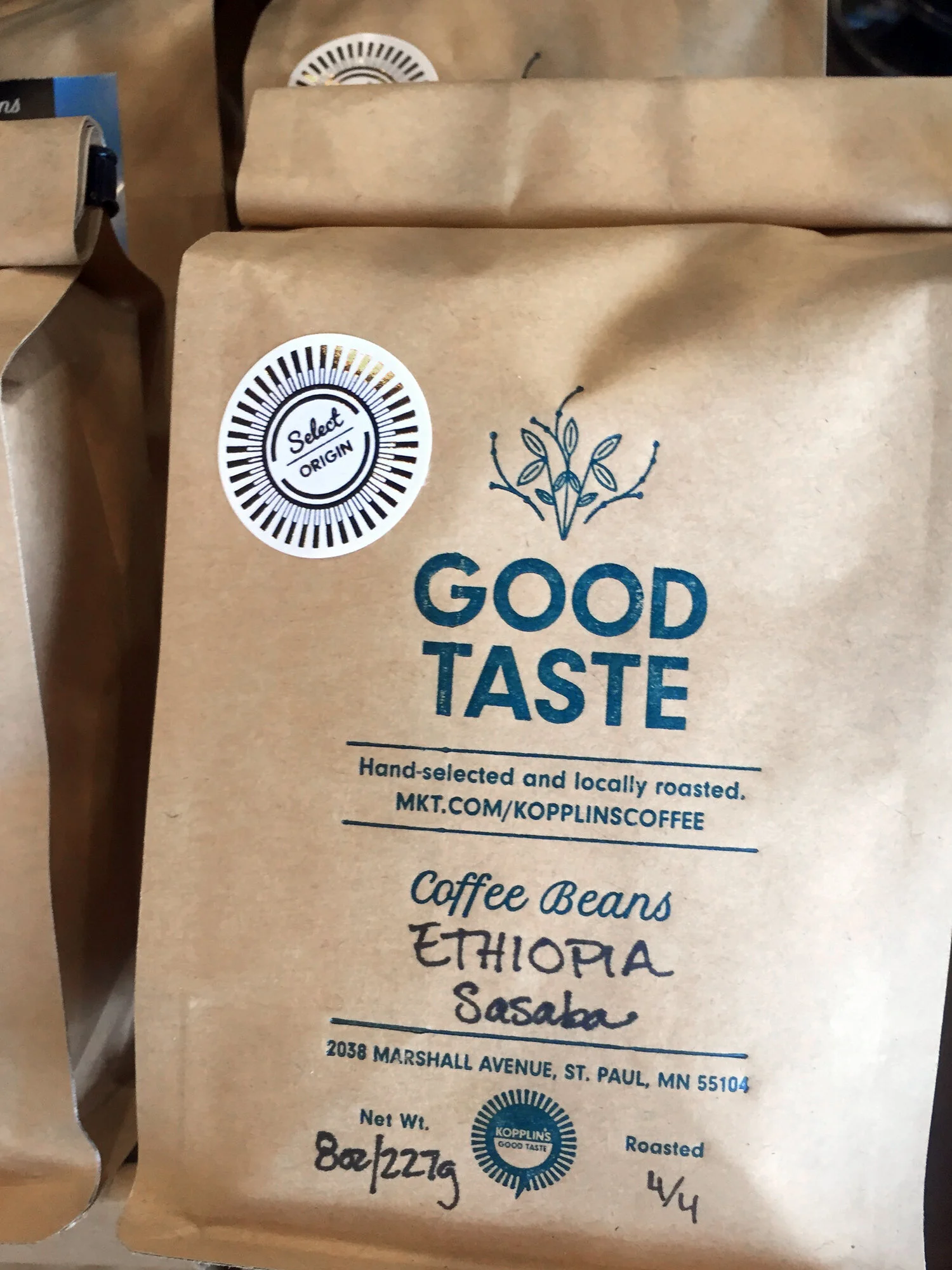
Kopplin’s Coffee hand-selects and locally-roasts their coffee beans. I worked with the Kopplin’s to create the Good Taste moniker to compliment the primary brand and emphasize roasting their own quality beans. Together, the Kopplin’s Coffee brand and Good Taste moniker signify a consistent and quality product, sold in their coffee shop (closed 2025, online shop is still open) as well as select local restaurants.

In an effort to reduce to-go waste, reusable thermal Keep Cups joined local maker products on the cafe’s retail shelves. Adorning with the artful Good Taste illustration, rather than the cafe logo, was a purposeful decision with emphasis on the Good Taste moniker from the Kopplin’s Coffee coffee bean packaging.

Packaging Feature
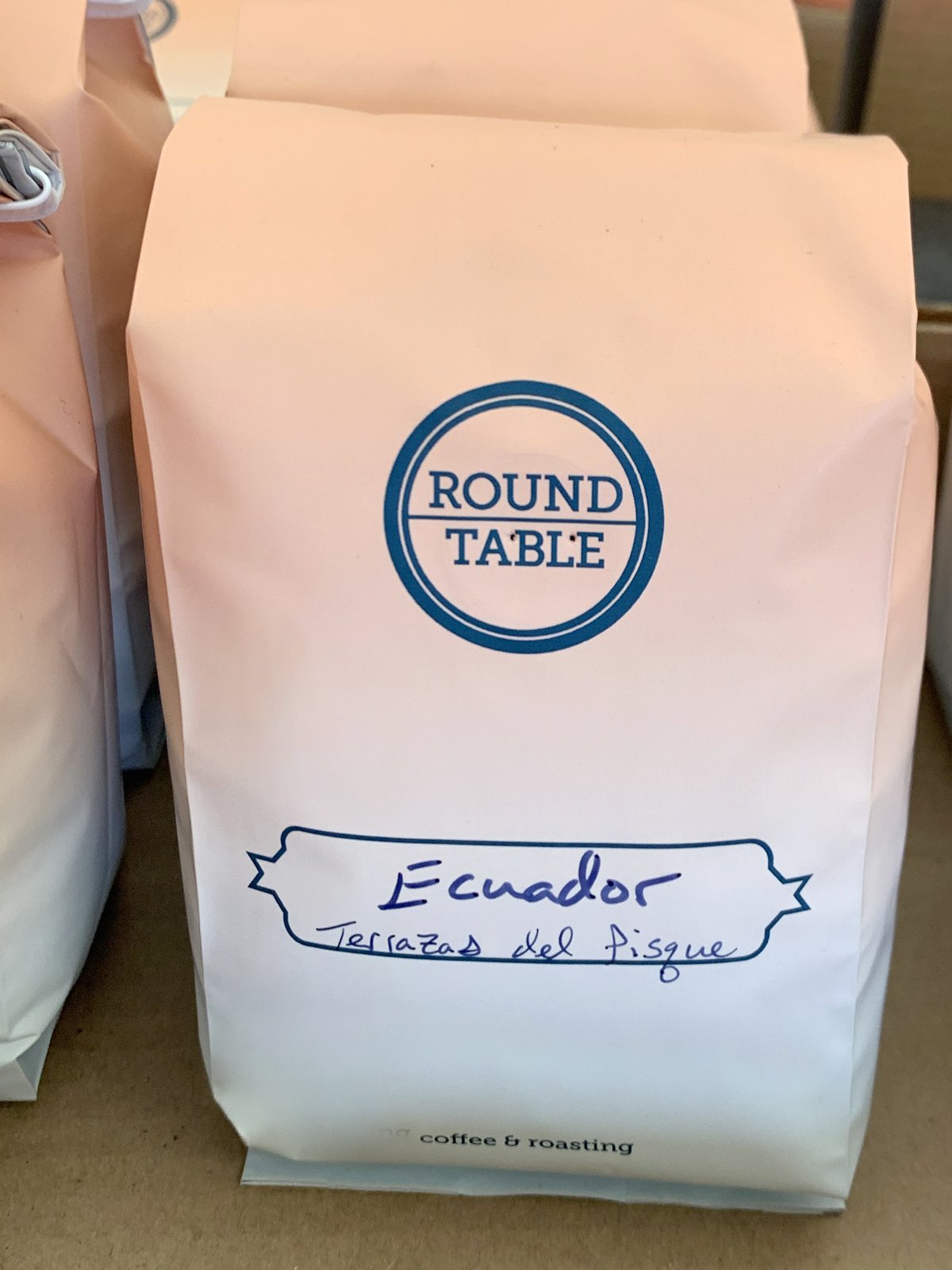
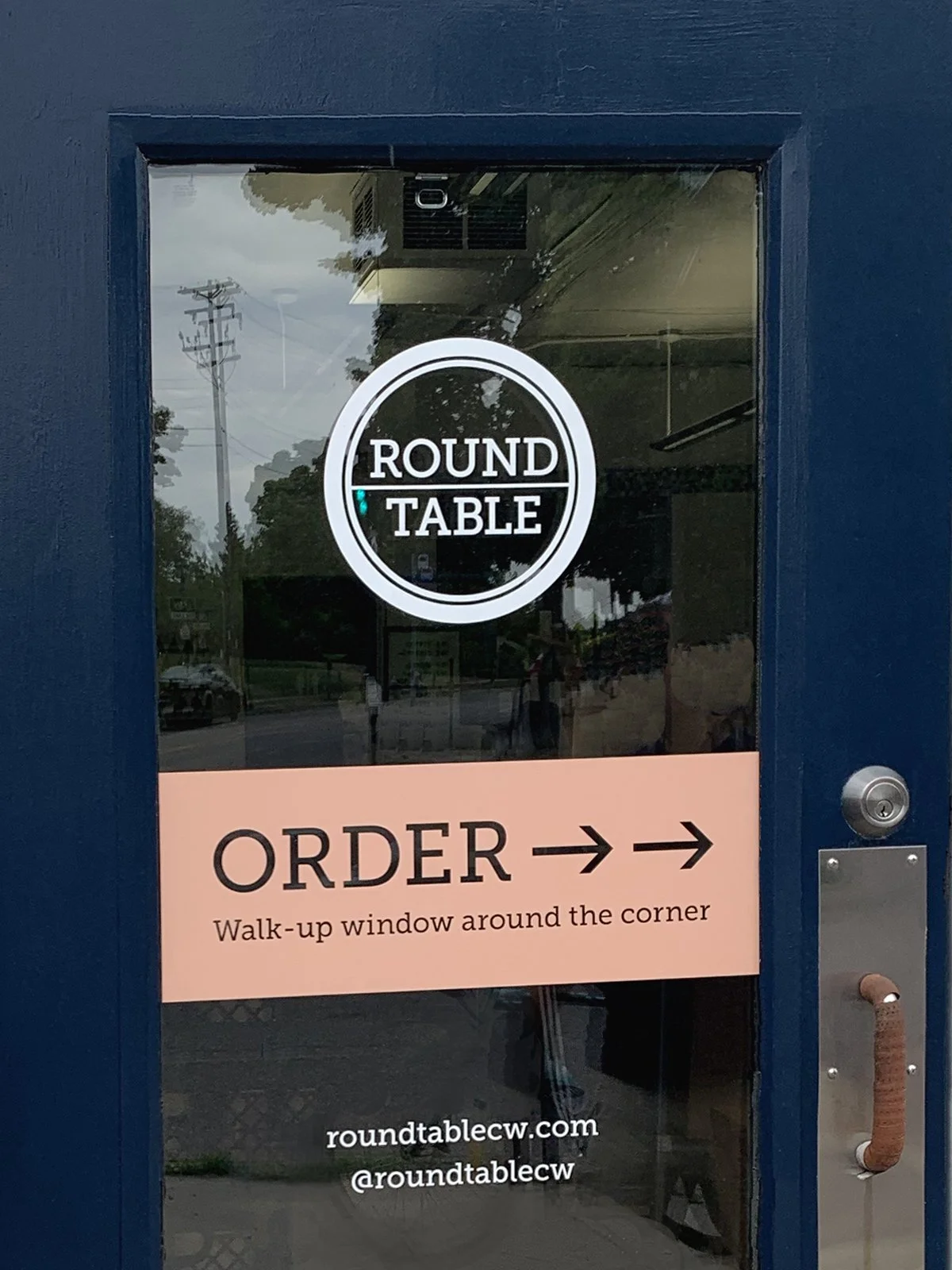
Roundtable Coffee Works
Working with Roundtable Coffee is always joyful and this coffee bag design resonates with the good vibes when you visit their walk-up window. The gradient design feels like a sunrise. This updated and modern pink and navy color palette was integrated into other elements of their brand and signage. We implemented these changes thoughtfully to flow seamlessly into the cafe exterior while keeping costs low.
Packaging Feature
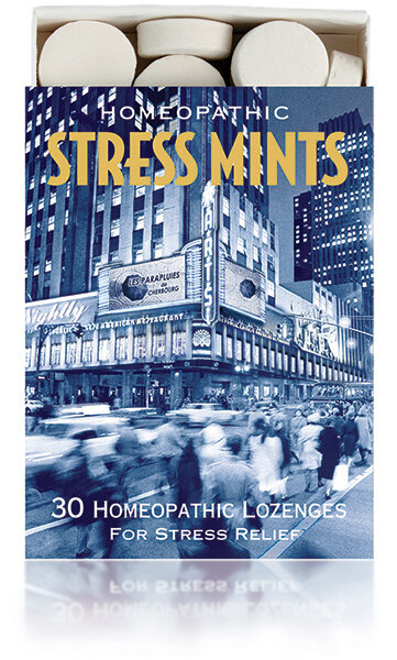
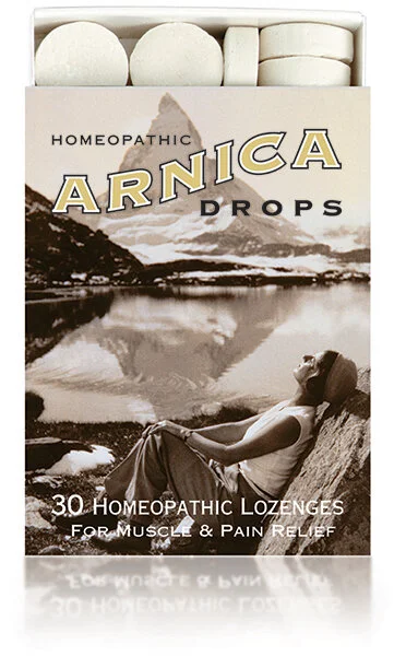
Historical Remedies
It’s not always easy to take over a project that was conceived by a different designer, but in this case it’s been a joy. It’s important to uphold the visual integrity of these popular nation-wide homeopathic lozenge products while refining and updating their design to keep them relevant in the marketplace. The foil-stamped and embossed packages for this family of trusted products stands out on shelves. Robert and I relish fussing over small touches that improve the brand, like designing a stamp that celebrates the company’s achievement for over 30 years of business.


Packaging Feature
Cedar Summit Farm
We assisted Cedar Summit Farm in their call for public support while in a legal battle with a utility company. During this time, we worked together to reimagine their logo, create public awareness campaigns, and implement refreshed design into new environmentally-conscious packaging, which included recyclable and returnable bottles.
Despite the publicity, the financial repercussions were great. The 100-year-old family farm closed its doors in 2015, a sad outcome for the family and all who supported the 100% grass-fed dairy farm. The legacy of their commitment to values lives on through their story, and I am proud of our work together during my years with Good Work Group.

